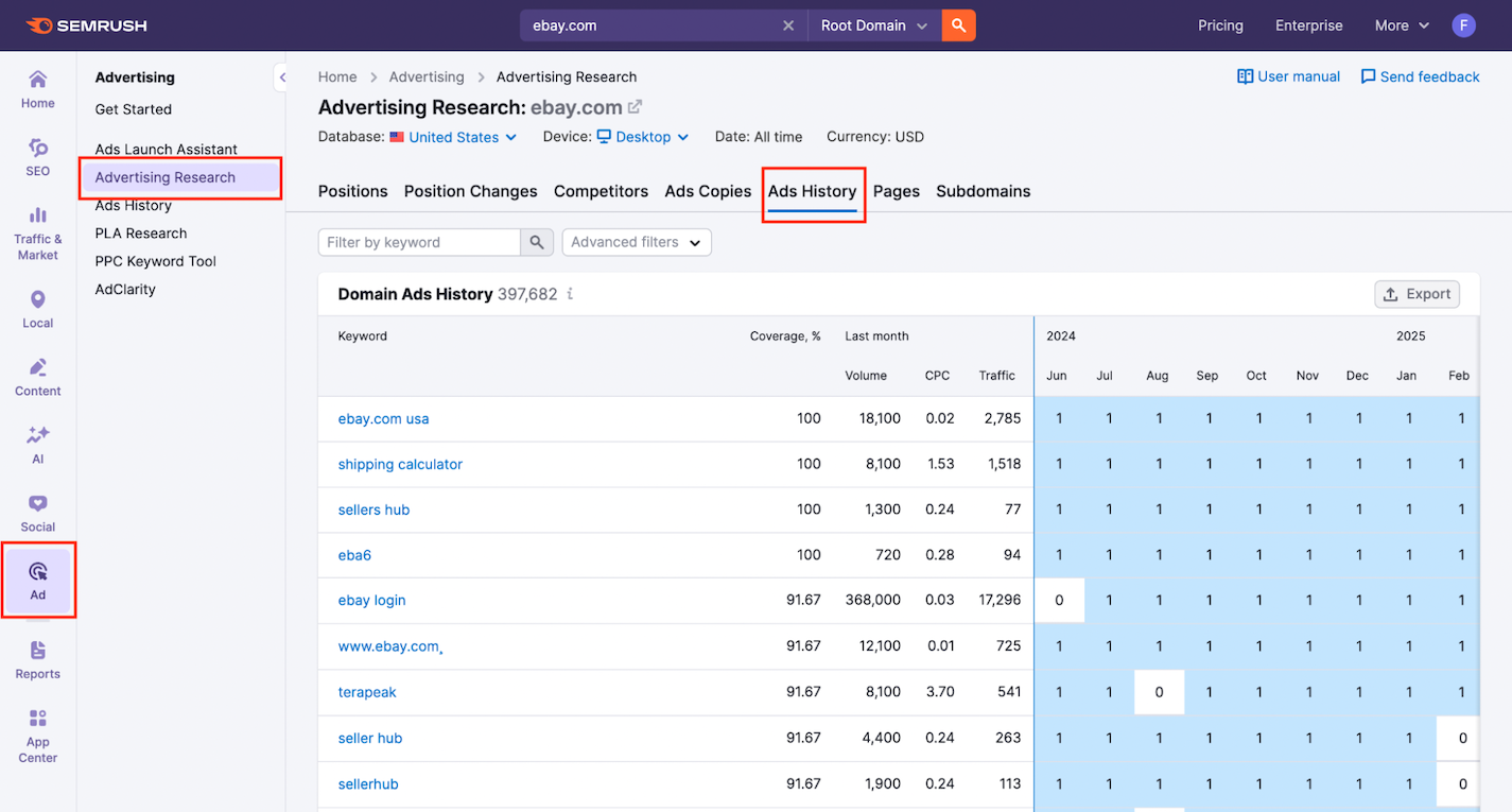
The Ads History tab in Advertising Research gives you a 12-month timeline of ad appearances across Google’s paid search results. This feature zooms out to show you when a domain’s ads appeared for a specific keyword, how often they showed up, and exactly what they looked like.
Ads History is a powerful tool for spotting seasonal trends, comparing ad consistency, and evaluating which messages have stuck around the longest.
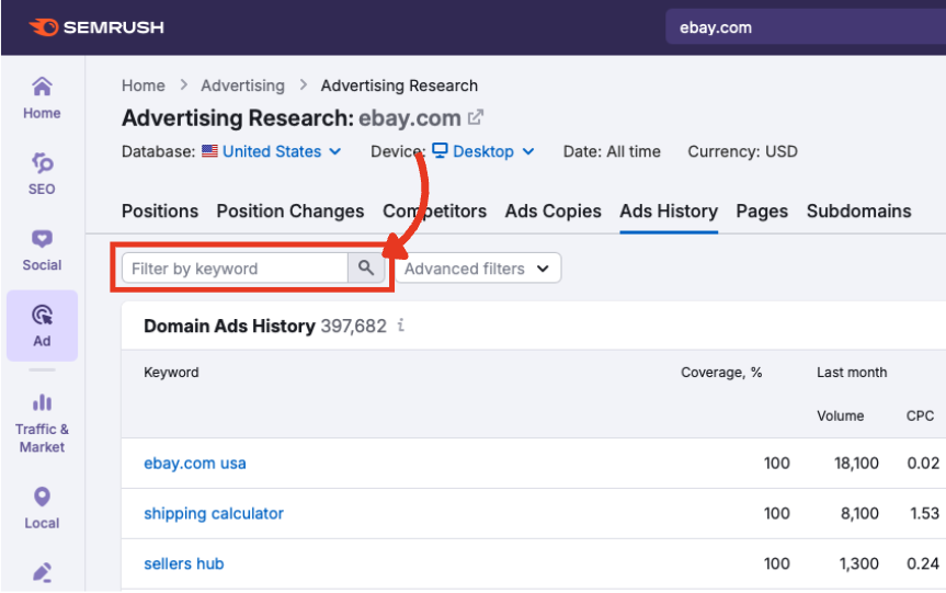
To access this report:
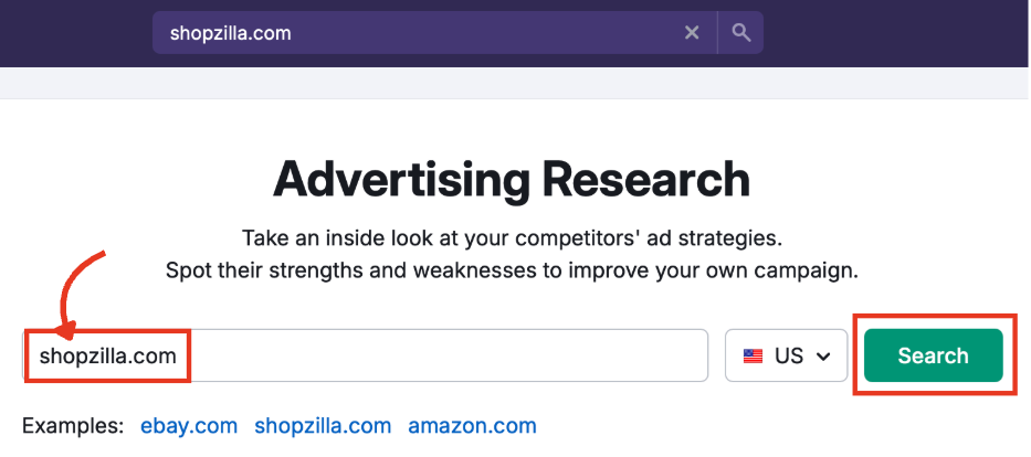
- Open the Advertising Research tool in the left-hand Semrush menu.
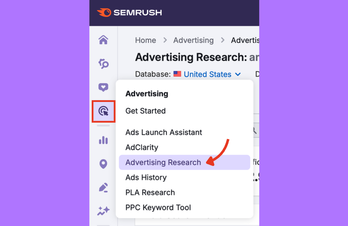
- Enter your target domain in the main search bar.
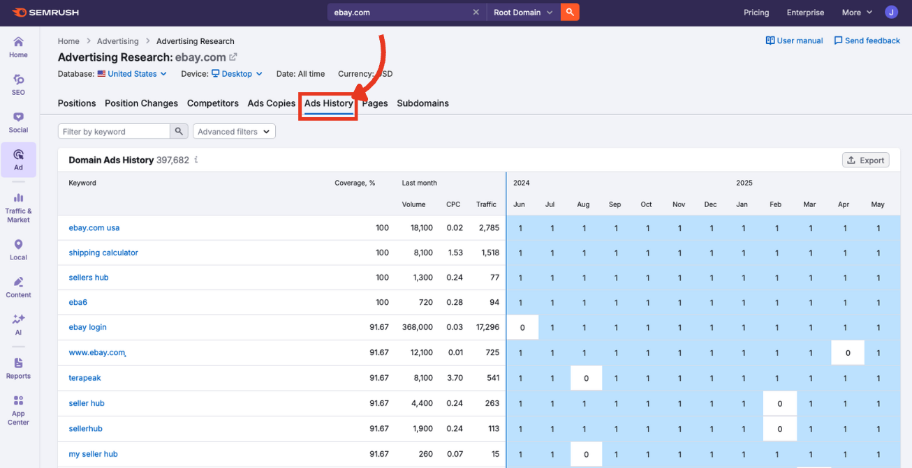
- Click the Ads History tab.
Step 1: Macro Settings
The macro settings at the top of the dashboard define which data appears in the Ads History chart and table below.
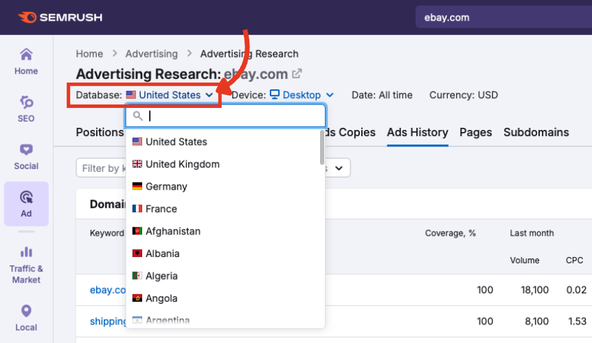
Database
Choose a country to view ad history in that region’s Google Ads environment.
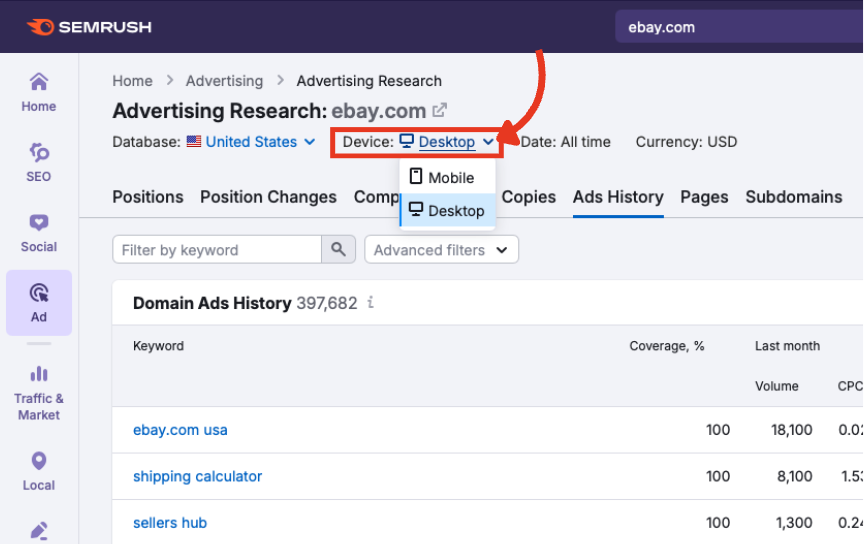
Device
Switch between desktop and mobile to compare campaign performance across platforms.
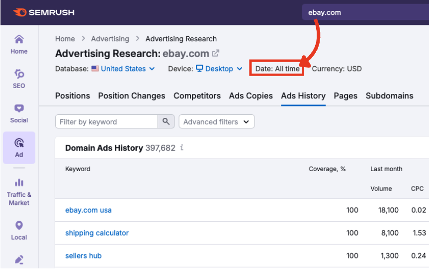
Date
Fixed to “All time.” The table always shows the past 12 months.
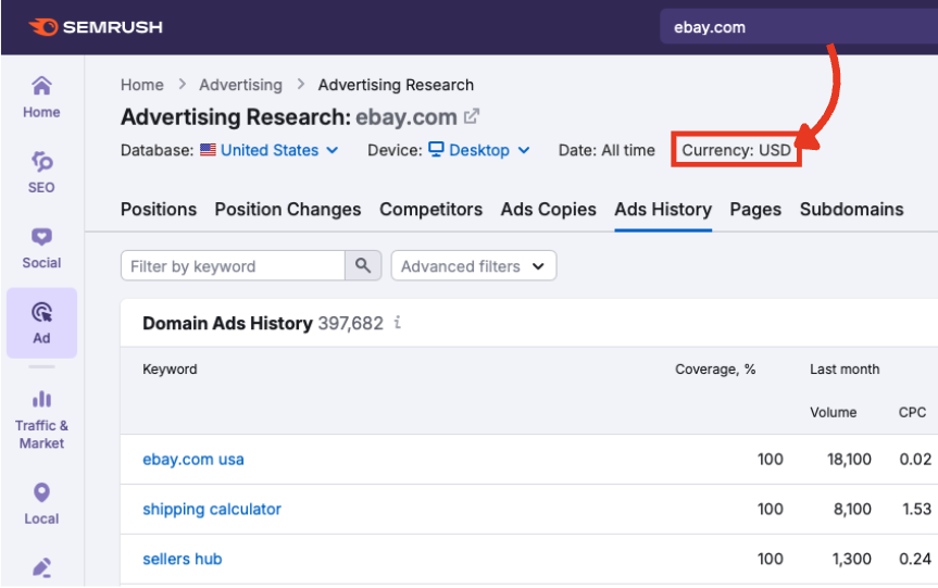
Currency
Determines how CPC data is displayed, based on the country selected.
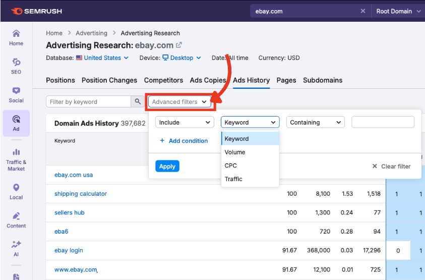
Step 2: Apply Filters to Focus the View
Isolate the ads that matter most with two filter types that narrow the table down to only the most valuable insights.
Keyword Filter
Type a term into the filter by keyword field to uncover the most relevant ads.
Advanced Filters
Refine results by keyword, volume, CPC, and traffic. You can include or exclude parameters, and add multiple filters at once.
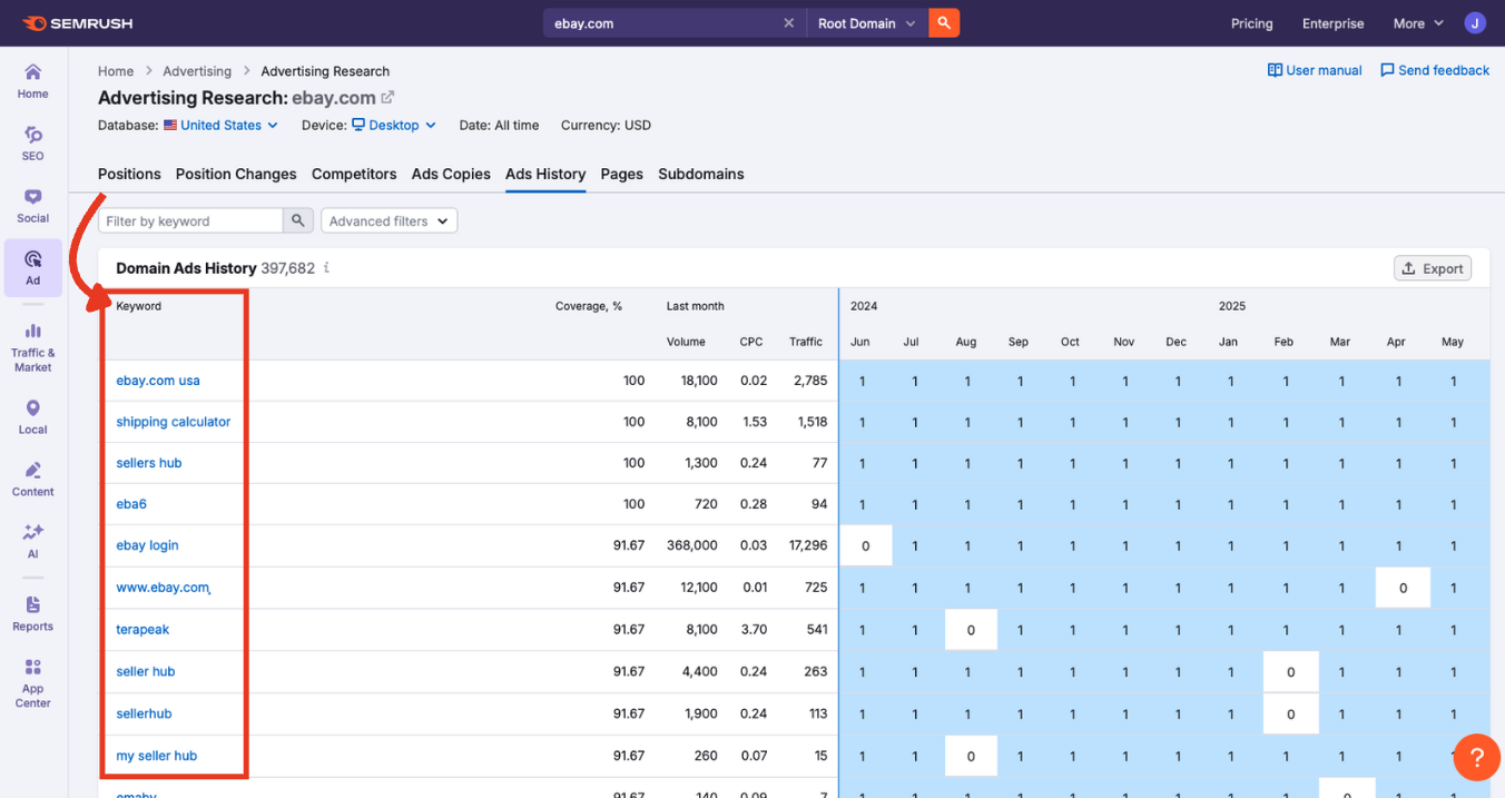
Step 3: Analyze the Domain Ads History Table
Once you’re happy with the settings and filters, scroll down to the Domain Ads History table.
Each row represents a keyword, while each column (from left to right) breaks down performance by key metrics.
Keyword
The exact paid keyword the domain is bidding on. Click the keyword to explore it in the main Ads History tool.
Coverage %
The percentage of time, over a year, that the ad appeared for the keyword in Google's top eight paid positions.
Higher percentages suggest consistent investment in this keyword over 12 months.
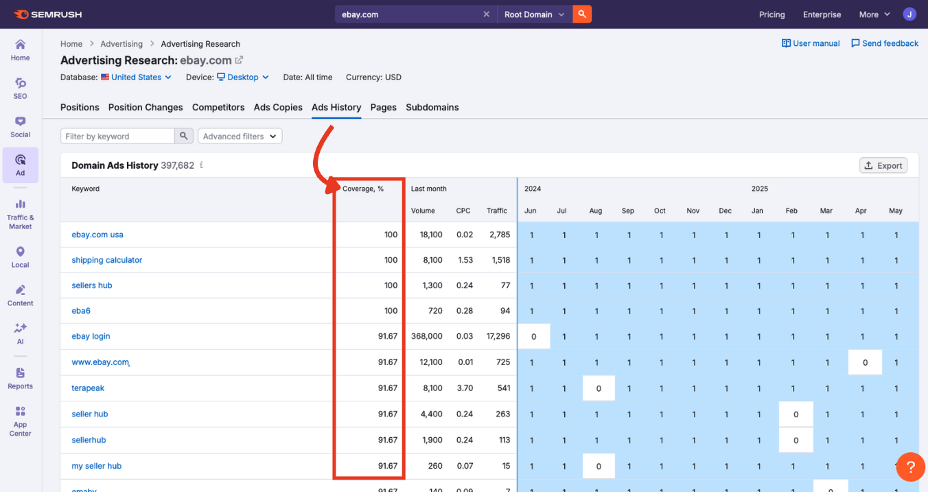
Last Month
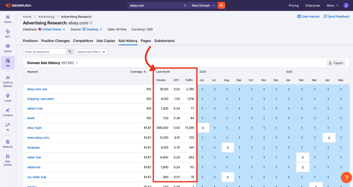
This set of columns shows:
- Volume: Estimated monthly search volume for the previous month
- CPC: Average cost per click for that keyword
- Traffic: Estimated paid clicks driven to the domain in the previous month
These values help you gauge the keyword's current value and performance—useful for comparing with previous periods in the table.
12-Month Timeline Chart
Each blue square in the timeline represents a month. The number inside the square shows the highest ad position achieved (1 being the best).
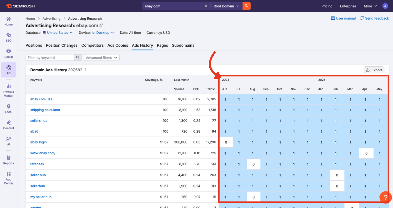
Clicking a square shows the most searched ad that ran for the keyword that month.
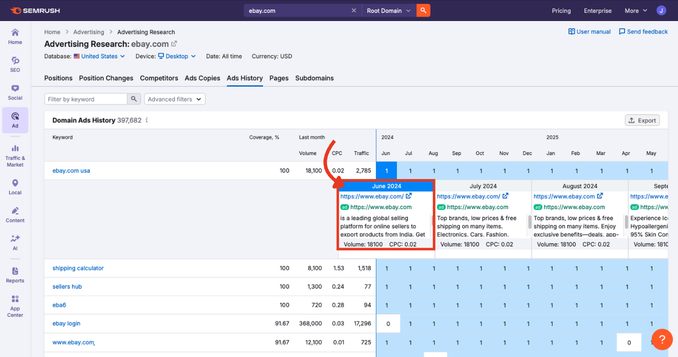
In this expanded block, you’ll see the:
- Month at the top
- Landing page in blue (clickable)
- Display URL in green
- Ad copy
- Search volume and CPC (cost per click)
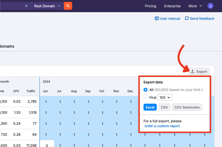
Step 4: Export Your Data
If you want to save or share your findings, click the export button at the top right of the table.
Export the full table or a select number of rows in Excel, CSV, or CSV (semicolon) format.
Continue Exploring Advertising Research
The Advertising Research Ads History report helps you understand how paid search campaigns evolved over the previous 12 months.
Once you’ve explored the Ads History tab, the next step is the Pages report. This view highlights which landing pages are receiving the most paid traffic to help you understand where successful ads are sending users.
From there, explore the rest of the Advertising Research toolkit based on what matters most to your goals:
- Positions: Discover which keywords a domain currently ranks for
- Position Changes: Track gains, losses, and new paid terms
- Competitors: See who else is targeting the same keywords
- Ads Copies: Analyze creative formats, offers, and messaging
- Subdomains: Understand how paid traffic is spread across site sections
Each tab has its own manual to help you navigate it confidently. Work through them in sequence or jump straight to the insights that matter most to you. For a complete assessment of your paid ads performance, try all the other tools in our Advertising Toolkit.